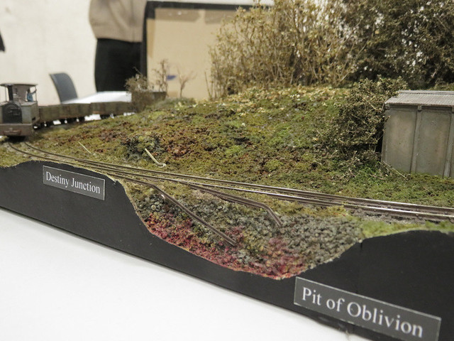
Now I've had time to recover from EXPO-NG I've downloaded my photos. I thought since Joshua and I were in the Dave Brewer Challenge I'd start with those. The challenge was a layout in proportion 50x35 up to that size in cm.
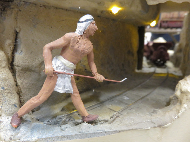
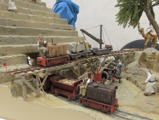
The winner was Toot 'n' Come In (1:32, 16.5mm gauge) by Steve Pearce. An imaginative and detailed model based around an Egyptian tomb excavation. The layout was battery powered with trains on two levels, although they didn't have far to move. Openings in the side revealed the workings in the tomb.
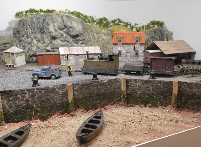
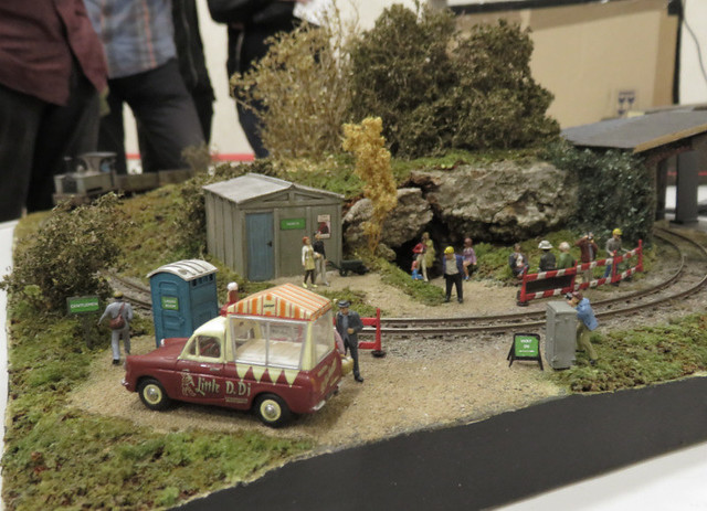
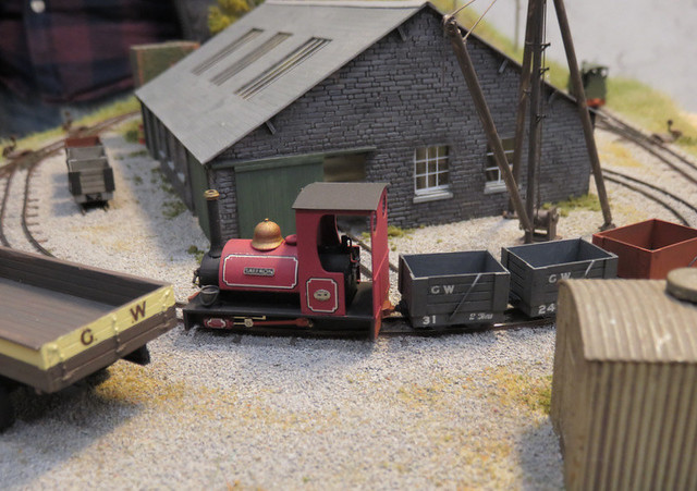
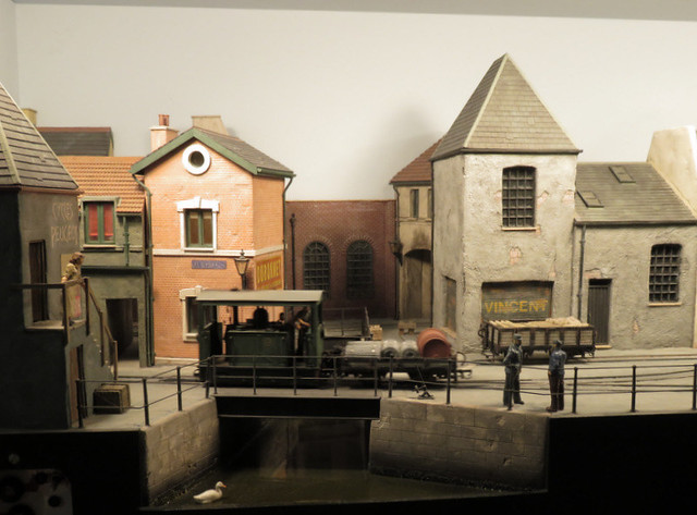
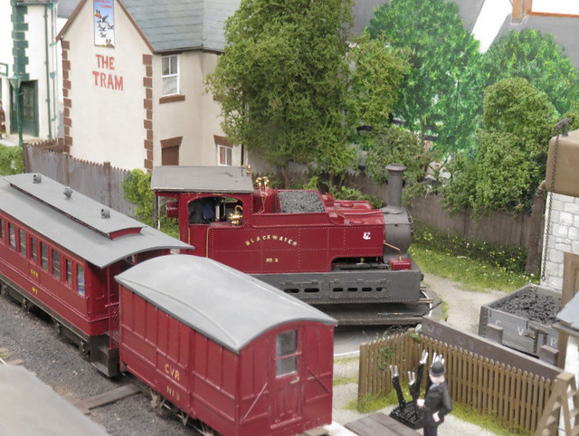
St Petroc Quay (009) by Harry Dawe was one of my personal favourites, it was full of atmosphere. I think we'll see lots more from this young modeller.
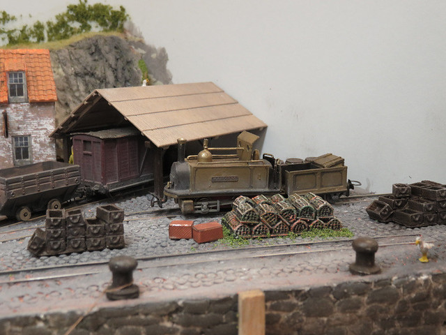
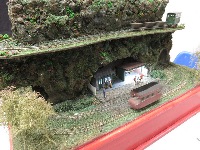
Life of a Line (009) by John Wilkes tells the story of a railway from horse-drawn tram, through rise and decay, to rebirth in preservation.
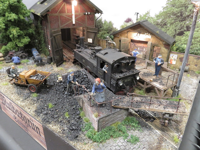
Bw Muldasgrun (Oe) by Christian Danziger & Ronny Rudolph, who had flown in from Germany with the layout in a flight-case. The scene is superbly detailed and featured a moving coaling platform, as well as automatic DCC operation with sound.
Ashen Vale (009) - Rae Haigh
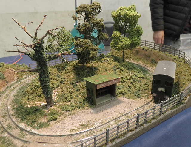
Woody End (009) - Richard Glover. Even smaller than the maximum size.
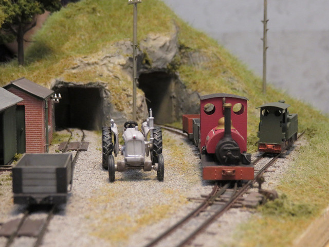
Vowchurch Slate Quarry (006.5) - James Hilton. The smaller gauge allowed James to fit in several sidings as well as a circuit, with some nicely modelled buildings. The layout was inspired by a story by Brian Clarke. These tiny models are beautifully finished.
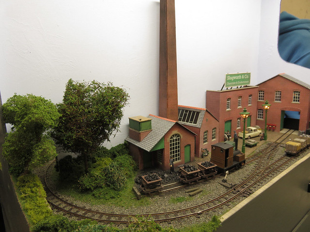
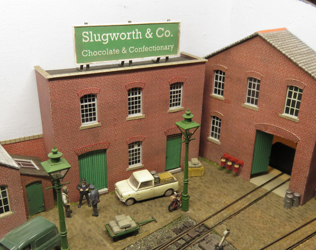
Finally of course, Slugworth (009) by Joshua Campbell, with a little help from me!
Michael Campbell's blog about his model railways. Building model railway layouts in 009 (OO9) scale
Pages
▼
Tuesday, 30 October 2018
Sunday, 28 October 2018
On Show
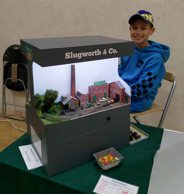
At last the big day arrived, here's Joshua with his layout set up for it's first exhibition at EXPO-NG:
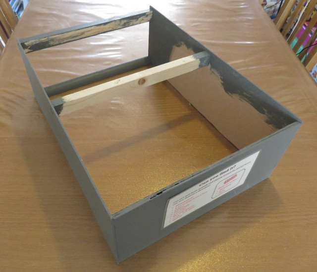
You can see the effort he made with the presentation - this was important to him, along with the lighting pelmet. We made a simple stand to lift the layout to a better viewing height, which is simply a couple of panels of thin MDF (left over from the baseboard), a piece of ply, and a few lengths of softwood; the layout sits on the cross-members and slightly recessed between the sides while the open back end allows cables and the transformer to be hidden underneath
He wanted the layout name on the front, which we ordered online and was easy to fit. He also designed a Slugworth logo that's on the end of the layout, and put together a "can you find" list to keep children (and a few adults) amused. Finally he set up bowls of jelly beans and chocolate drops - to demonstrate the "produce" of the factory!
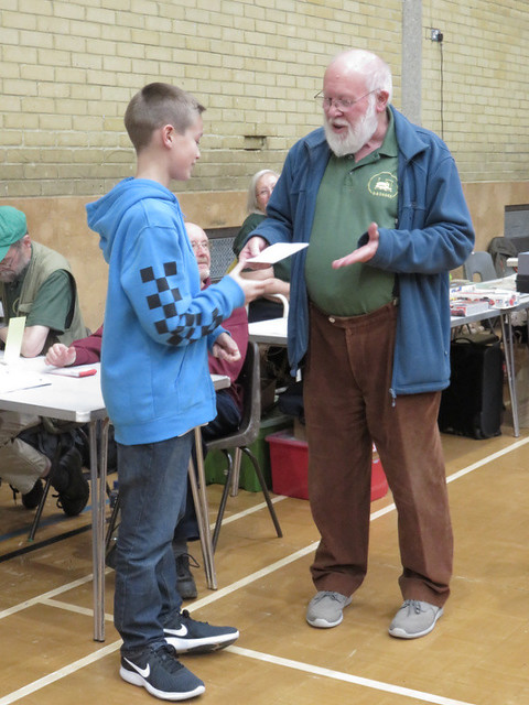
All 8 Dave Brewer Challenge entries had made it to the show with completed layouts (that doesn't always happen), and the standard was very high, so at 3:30pm Joshua was keen to see the winner announced so we went to the main hall. It was Steve Pearce, with "Toot 'n' Come In", well deserved for a fine piece of imaginative and well executed modelling. We then headed back to the layout - having briefly left it unattended - but no sooner had we go there than we were told to head back to the hall, where Joshua was given an award for "Junior winner". I've never known that done before, so we were surprised - and Joshua was clearly delighted. Cue proud Dad moment...
The layout attracted a lot of interest and it was nice to see the little squash court hosting the challenge entries was busy most of the day (it is rather out of the way), which helped us forget the numbing cold in that room! Thanks to all those that said hi and nice things about the layout. Good to see many familiar faces and meet a few new ones too.
Thursday, 25 October 2018
It's a sign!
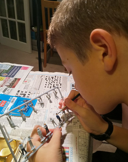
Recent posts on progress with Slugworth have gradually caught up with where we were at - I had got rather behind posting in the summer. The last few weeks have been focused on preparing, painting, and placing the details and figures that bring the scene to life. Joshua really got into the painting, though I got delegated the really fiddly bits!
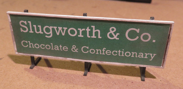
One thing we felt the factory lacked was an identity - it risked looking bland and anonymous. We decided it needed a sign. Joshua produced a sign on the computer which we printed out in several sizes to see which looked best, we then made the backing and frame to fit it from plasticard and microstrip. The supports were made up from some small H section plastic to look like girders. The frame was painted white to match the lettering.
It looked a little stark initially, so we dusted it with weathering powders - paper, frame, and supports - which toned it all together and disguises the use of different materials.
The completed sign was then stuck to the top of the flat-roof part of the factory, where it adds some visual interest as well as distracting from the low-relief nature of the building. And now there is no ambiguity over the purpose of the factory!
That shot shows a few of the other details added too. So with a few finishing touches completed today we are just about ready for the big day! If you can get to EXPO-NG on Saturday do say hello - and Joshua has a challenge for the visitors too, with rewards!
Monday, 22 October 2018
Uckfield scores again!
Last Saturday I made the trip to Uckfield for the local show, which always manages to have really stunning layouts, so that it feels more like a showcase exhibition than a club show. Perhaps it's the attraction of the exhibitors lunch? Anyway this year was no different.
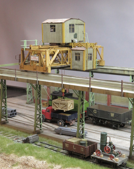
Let's start with The Yard (7mm scale, 32 & 16.5mm gauges) by Martin Coombs and Friends. A new dual-gauge layout with DCC sound, radio-control lorries, and operating crane, demonstrating transferring loads between gauges and road transport - all hands off. Impressive, nicely detailed and presented too.
I love Christopher Payne's layouts, which all have so much detail and charm. St Pierre et la rue Perrin (1:34 scale, 16.5mm gauge) is full of French atmosphere.
Fintonagh (7mm scale, 21mm gauge) by Dave Holman was a lovely layout based on Irish narrow gauge - the Clogher Valley Railway in particular - and built to scale 3' gauge, to a very high standard. One I'd not come across before, but hope to see again.
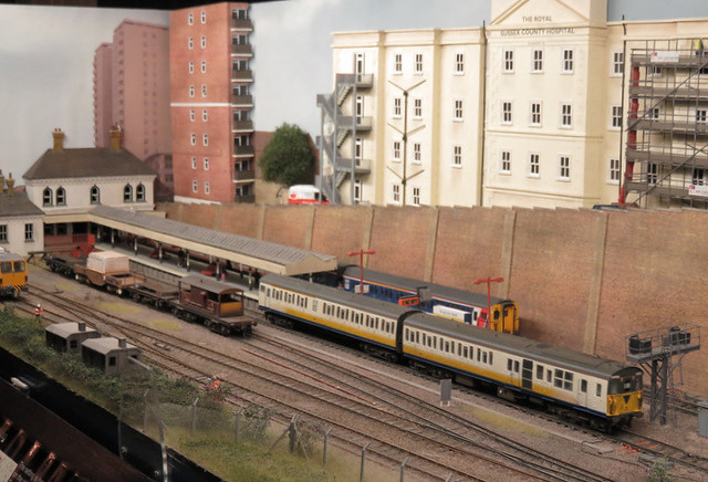
A "local" themed layout was Brighton East (EM) by Dave & Matt Smith, based on a might-have-been concept. Everything about the layout - stock, station, background buildings (including the Hospital), and even the bus livery - set the location so effectively the station name-board wasn't needed. Very nicely done.
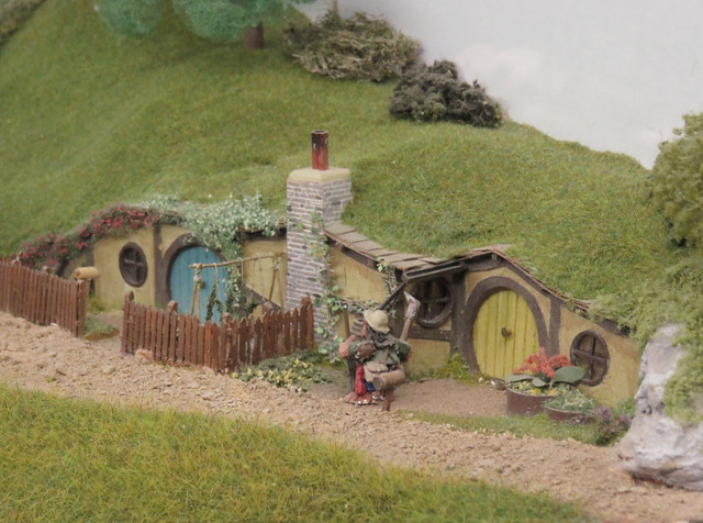
And finally, you may have come across Hobbiton End (5.5mm scale, 9mm gauge) by Simon Addelsee in Railway Modeller recently. I'm disappointed to see a letter in the latest issue complaining about it being featured - are people really that sad? Anyway, I love it - it may be fantasy, but it's done seriously and to a high standard. And one of my favourite photos didn't even include a train.
I shall have to stop there, but there were many more layouts that I liked - including one by the local high school club - so do have a look through more photos here.
Thursday, 18 October 2018
Three little engines
A quick update on some dirty locos...
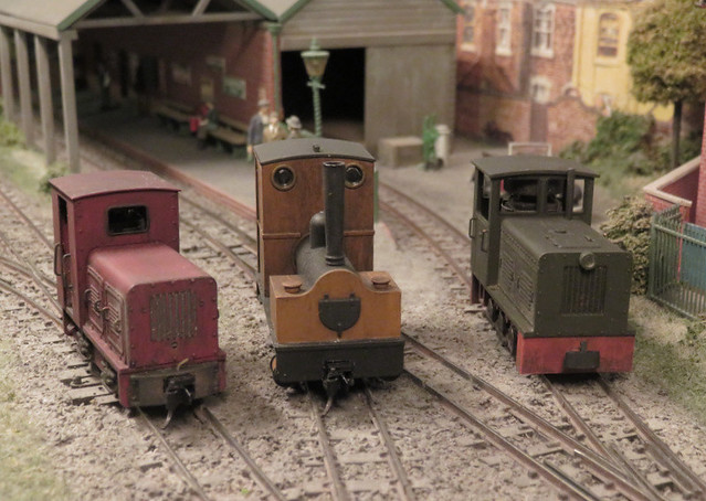
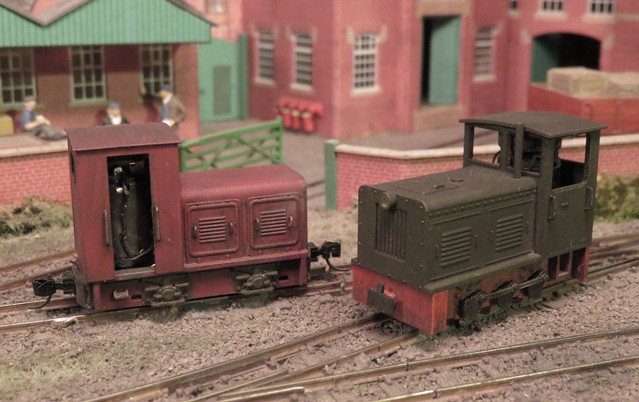
The NS2 has been sitting around for nearly a year since the last update when it was ready for painting. As you can see I did decide on red, using Humbrol enamels mixed to a shade I liked and applied with my airbrush. Then both this and the green NS2F - an unmodified Minitrains loco - got a dose of my usual weathering, consisting of a dirty well thinned enamel wash, followed by weathering powders. Both still need glazing and a crew, or perhaps tarpaulin sides for the NS2.
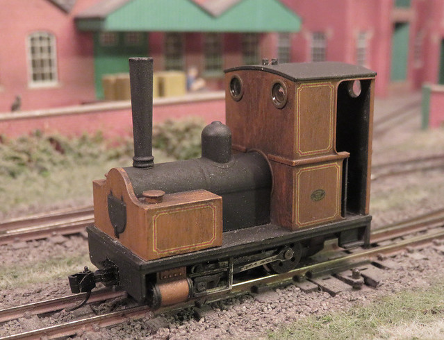
I'd also had the Minitrains Bagnall in a box for some time. This required a change of couplings, and something doing to tone down it's shiny, plasticky finish. However I liked the colour as being a bit different, and the lining is nicely done, so I settled on a simple weathering exercise. I've probably over-done it a little, but it suits an industrial setting and it certainly looks a lot less toy-like now. There's plenty of potential for detailing this loco, and I may add some pipework or toolboxes - as much as anything to try to disguise the slab sides under the boiler - but for now I think it just needs a crew.
So three more locos ready to enter service, all run sweetly thanks to the Minitrains chassis, but they are unlikely to fit Awngate (except perhaps the Bagnall). However, they will fit in well on Slugworth, so I think my Son will be borrowing them...
Monday, 15 October 2018
More lights
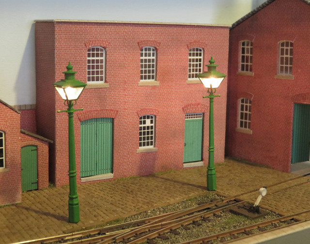
Back at the Gaugemaster event last month I picked up a pack of 3 working lamps by DCC Concepts reduced to under £6 due to, according to the label, "old packaging". Joshua was excited to add lights to the scene, though it's something I've not done before.
The lamps come with a circuit board to drive them and the instructions say it can be powered by voltages up to 16V A.C. However, I have a similar pack of lamps by Gaugemaster for another project, with an apparently identical circuit (I think they are made by the same people), but the instructions for those say on no account to use 16V A.C. such as the accessory output of a controller, as the peak voltage can be much higher. I guess I could have found an old "wall wart" to power it, but my standard power feed to a layout includes the 12V controller output, plus a 16V A.C. feed from the second winding of the transformer, so it made sense to use that. But to be safe I figured a preliminary voltage regulator would be a good idea, in case the circuit wasn't happy with the 16V A.C I would have made one myself but for under £2 I found a ready made circuit on eBay - a no-brainer really.
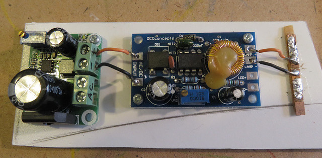
This circuit board is seen on the left, and can be adjusted to give between 3.3 and 12V D.C. with the little screw, from up to 20V A.C. We set it to 12V using a multimeter to check the output, and connected it to the input of the lamp driver, with both circuits screwed to a small piece of board.
The lamps come with fine enamelled wires, which can be soldered without having to remove the insulation, so we used strips of PCB sleepers to attach them to. Having tested them with the circuit we mounted them on the layout, the instructions say a 2.75mm hole is required, but that must be if the lamp is used without a base, as can be seen the tube that extends below the base is very fine - about 1mm diameter.
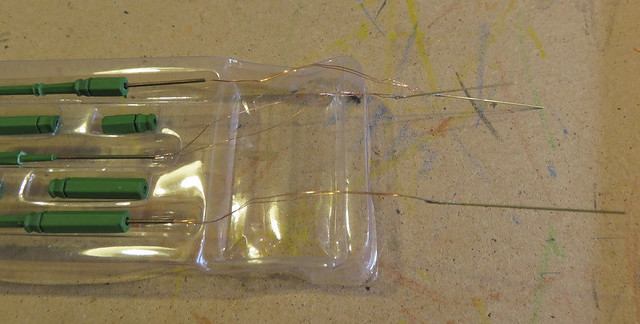
The problem was threading the fine wires through such a small hole in the baseboard (two layers of foamcore board). My solution was to tack-solder them to a length of stiff wire to act as a needle as seen above, pass them through the hole, then remove the wire with a touch of the soldering iron. The lamps are held well by friction, but we added a blob of hot glue where the tube exits the board to secure them.
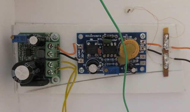
The piece of board with the two circuits on was then glued to the underside of the layout, and we made the wiring connections, which included a push-button on the front of the layout to switch them on. The lamp wires were connected via strips of PCB, and finally, we powered up the layout to check them out.
Monday, 8 October 2018
Green Fingers
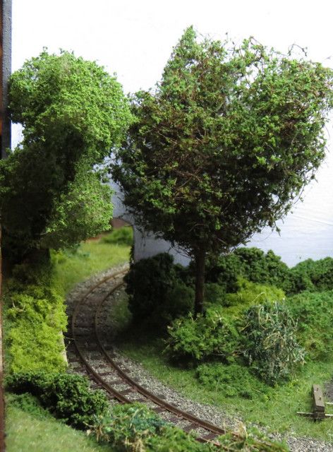
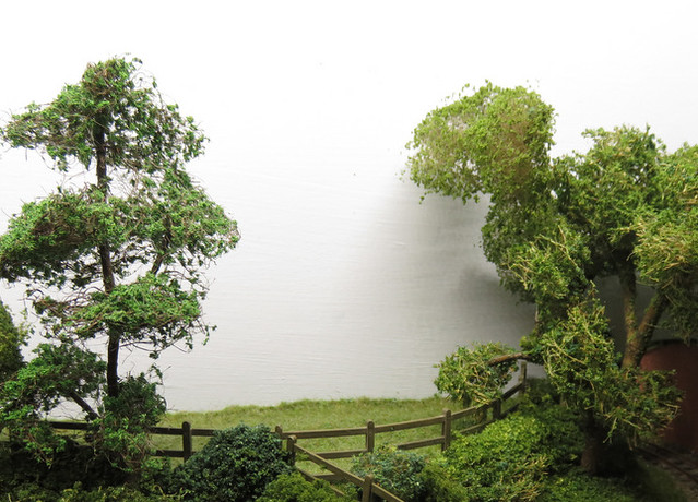
Continuing the scenic work on Slugworth we moved onto bushes and trees. Bushes and undergrowth is represented with a variety of scenic materials, including rubberised horsehair, various teased-out fibrous materials, and even some lichen. These were covered in scatter and ground foam in various shades of green, the idea being to give an impression of different types of plant rather than any attempt to model specific types. It's a messy and surprisingly time-consuming task, but adds a lot of texture to the landscape.
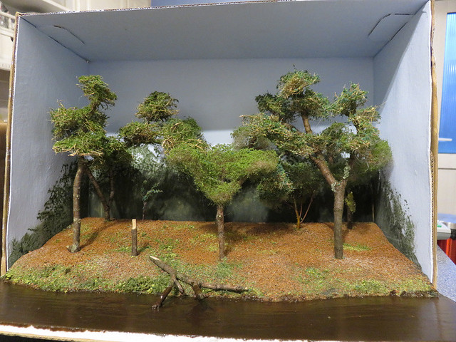
The trees are all Joshua's work. I've mentioned the scenic demo exhibition stand by Roy Hickman before, who gets kids involved making scenic items. Joshua has made a couple of trees under his instruction, which use real twigs, rubberised horsehair or teased-out fibres stuck on with hot glue, and scatter material fixed with cheap hairspray. Then he had a homework project to model the rain forest (no, I've no idea why) - so he used the same technique to make a number of trees.
We'd kept the model thinking the trees would come in useful, so now we have uprooted them and replanted those that fitted best onto Slugworth, along with those he'd made on Roy's demo stand. Some got a refresh of scatter along the way. Such a simple method, however I think they are really impressive, and better than any trees I've ever made from twisted wire...
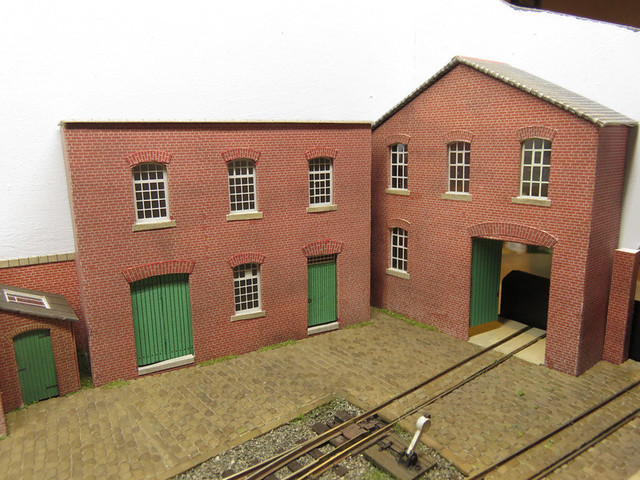
Meanwhile, the buildings are getting bedded in to the factory yard. Although they fit into the cobbled yard which minimises any visible gap, we did find the long thin "tufts" of static grass we made on the foil worked well along the edges of the buildings.
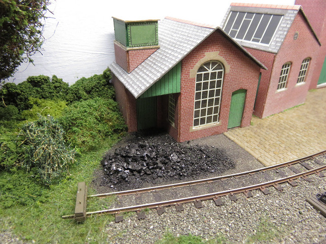
At the end of the yard we wanted a gravel/cinder ground finish, which we simply achieved sprinkling sand onto PVA glue. This was then painted dark grey with acrylics. Joshua then crushed a lump of real coal with a hammer, which was used to make a pile of coal outside the boiler house.
Things are really coming together now. Just some final details to add, although they can take a lot of time...
The trees are all Joshua's work. I've mentioned the scenic demo exhibition stand by Roy Hickman before, who gets kids involved making scenic items. Joshua has made a couple of trees under his instruction, which use real twigs, rubberised horsehair or teased-out fibres stuck on with hot glue, and scatter material fixed with cheap hairspray. Then he had a homework project to model the rain forest (no, I've no idea why) - so he used the same technique to make a number of trees.
Meanwhile, the buildings are getting bedded in to the factory yard. Although they fit into the cobbled yard which minimises any visible gap, we did find the long thin "tufts" of static grass we made on the foil worked well along the edges of the buildings.
At the end of the yard we wanted a gravel/cinder ground finish, which we simply achieved sprinkling sand onto PVA glue. This was then painted dark grey with acrylics. Joshua then crushed a lump of real coal with a hammer, which was used to make a pile of coal outside the boiler house.
Things are really coming together now. Just some final details to add, although they can take a lot of time...
Monday, 1 October 2018
Grey and Green
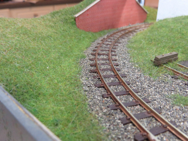
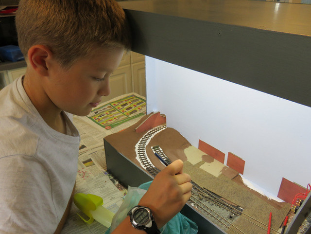
The next step with Slugworth was to ballast the track, using fine granite. It's one of those jobs that many find tedious, although on a small layout it is not too onerous. In fact Joshua rather enjoyed ballasting, leaving me to tidy up the edges and carefully do the points.
One tip we found useful was to tap the rail with a spoon, which shakes the ballast off the sleepers into the gaps. When in place the ballast was misted with a fine water spray, then dilute PVA dropped in.
After it was all dry a wash of thin brown acrylic paint was liberally applied over ballast and sleepers to tone it down a little.
We then moved on to grass. First we applied a layer of conventional scatter as a base layer, then on top of that, static grass. My cheap "fly swatter" applicator is sufficient for a small layout like this. We mixed different colours and lengths of fibres to get a realistic look.
We tried to vary the grass mix according to the use of the land, with longer strands and more lush looking grass on embankments for example.
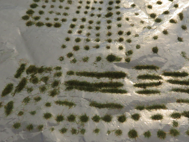
Finally, while the static grass was out, we had a go at making our own tufts on a sheet of tin foil. It kinda worked, but the PVA glue blobs were very difficult to remove from the foil, and often showed up under the tuft. Perhaps there's a better glue to use for this?
One tip we found useful was to tap the rail with a spoon, which shakes the ballast off the sleepers into the gaps. When in place the ballast was misted with a fine water spray, then dilute PVA dropped in.
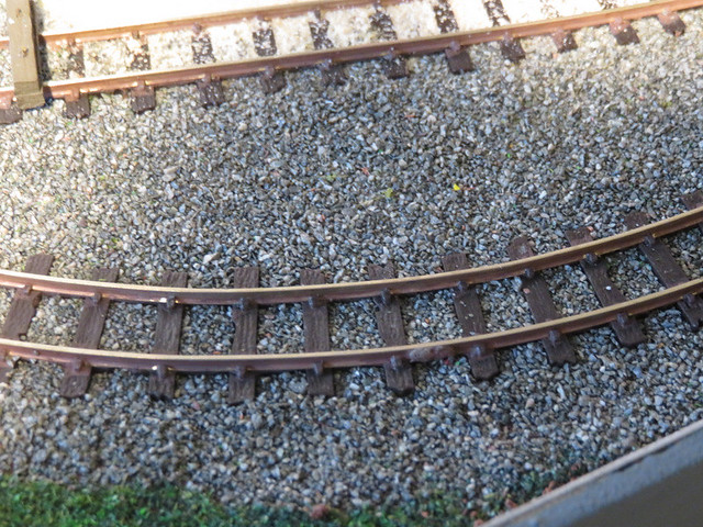
After it was all dry a wash of thin brown acrylic paint was liberally applied over ballast and sleepers to tone it down a little.
We then moved on to grass. First we applied a layer of conventional scatter as a base layer, then on top of that, static grass. My cheap "fly swatter" applicator is sufficient for a small layout like this. We mixed different colours and lengths of fibres to get a realistic look.
We tried to vary the grass mix according to the use of the land, with longer strands and more lush looking grass on embankments for example.
Finally, while the static grass was out, we had a go at making our own tufts on a sheet of tin foil. It kinda worked, but the PVA glue blobs were very difficult to remove from the foil, and often showed up under the tuft. Perhaps there's a better glue to use for this?